So you just got your new business idea or you’re going to rebrand an existing business. You can’t wait to show the world your new company vision. This is a very exciting moment, now take a deep breath, and don’t let your excitement overwhelm your logo design.
Rule 1. Think Iconic and simple
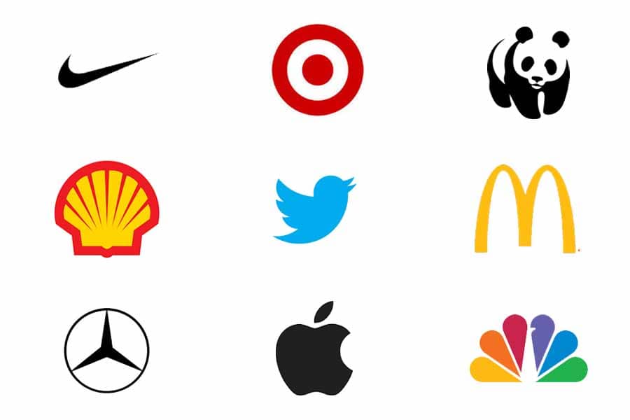
The purpose of your logo is to make an impression in the mind of the consumer, not tell the story of your business. Don’t worry, you will get to tell your story elsewhere, such as in your website, collateral material, etc. But when it comes to your logo, think iconic and simple. Think about it for a second. When you are driving down the highway and you see signs far away you will almost certainly know right away the name of the businesses with iconic logos. For example, what comes to mind when you see the “golden arches”? You could probably name every company in the above image based on their iconic logo.
Rule 2. Be Original
Make sure that your logo does not resemble other logos in your industry. A good example for instance is a dentist using a tooth. It makes sense, a dentist – a tooth, why not? You could do it and make perfectly good sense. However, if you’re seeking a unique image, that does not pass the originality test. There are dentists all over using it. A quick google search for example: “Dentist Logos, Images” will give you multiple examples of what everyone else in the market is doing. That is what you want to steer away from.
Rule 3. Be Timeless
Something that will stand the test of time. Modern but timeless.
Rule 4. Memorable
You want to make sure that it is something that will be remembered. Simple and iconic is the key. Close your eyes for a second and think of some well-known companies and what their logos are. They are probably very clear in your memory. When creating your own design, you can test this with other people by challenging them with a blink test. Put the logo on a piece of paper, ask them to look at it for three seconds then describe what they saw.
Rule 5. Design Balance and color
Make sure the design is balanced properly with the principles of proportion and symmetry. Colors have meaning, so make sure the meaning of the colors you choose fit your brand. Go to https://blog.hubspot.com/marketing/what-color-should-your-logo-be to get some ideas.
Rule 6. Versatile application
Remember in addition to signs and a website, your company logo will likely find itself on T shirts, Polo shirts, pens, coffee cups, ball caps, etc. A good designer should be able to give you mock ups as to how that will look. This will allow you to see how it will appear in various media.
Final thought, creativity is a process. Nothing will happen until you start putting ideas on the canvas. Start with something and get feedback from people who are not involved in the process. They will be able to give you the most honest feedback on whether or not your logo is making an impression. One method of “poor man’s” research is to put 9 different logos about the same size, in three rows of three. Let a group of people view it for no more than 30 seconds then ask them to describe what they saw. Is your logo amongst one of the ones they remembered? If so, then you’re on the right track.
As you work through the process of getting feedback and tweaking your input, you will realize you’re getting closer and closer to the goal. I tell all my clients, you will know it when you see it. It will be one of those aha moments. That’s when you can let the excitement loose!
Junkyard Dog Marketing helps clients in many industries with their logo design. We can be involved at any step in the process and we will make sure to understand your business because that is critical to the process. Contact us to discuss how we can help! dan@junkyarddogmarketing.com or (214) 455-8807.


